Morten Duemose — graphic design and art direction






No projects in this area yet.
Piola Pastificio
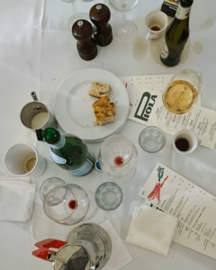
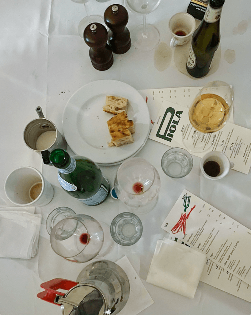
Piola Pastificio was just around the corner from our office, in a tiny space that used to be a fish shop. Working with Antonio and Johanne, the couple behind Piola, we quickly felt part of their family business. There was this feeling of being invited to a big Italian dinner, with time to talk, drink good wine and finish with a strong espresso. We wanted to carry that warmth into the identity. We kept thinking about the little cafés in Italy, where the lettering feels made by someone who works there, and different typefaces come together in ways you would never have guessed.
Made together with Sebastian Ygge
The idea for the menus came from old wine labels we spotted in the basement toilet at Bar'Vin: a simple frame, with a different artwork inside each time. It gave us a way to make each Piola menu its own piece, changing almost weekly at the beginning. We loved the quick crayon drawings on the wine menus. They felt like the end of a long dinner—a little wine spilled on the tablecloth, but that’s okay. Looking back, we’re proud of how much room the identity leaves for food, art and everything Antonio and Johannes put into the place. Simple, but with a lot of emotion. For us, it comes back to that feeling of being invited in: sitting around a table, being in the moment and feeling the warmth of the people around you.
Tourell
We kept coming back to that slightly irritating feeling when something is two things at once. Tine, Tourell’s founder, came to us with strong ideas about materials, production and how the jewelry should look. Through our conversations, we began to see those ideas in pairs: handmade and high-tech, pure and raw, simple and complex. The jewelry itself is swirly, looping into itself in forms that are really complex to make. The natural thing would have been to make something ornamental around it. We were more interested in putting something very controlled beside it and seeing what happened between the two.
Made together with Sebastian Ygge
That tension is concentrated in the wordmark. You can read it as a sans serif wanting to be a serif, or the other way around. It’s sharp and constructed, but there’s something organic in it that almost wants to break out. Around it, we used Helvetica and kept things almost entirely black on white. Very little to pull your attention away from the jewelry. We love that kind of minimalism, where you still get the feeling right. Seeing everything together was satisfying because it formed a whole and still felt like it was battling itself a little. The jewelry had room to shine, while the identity kept that small irritation. We wanted to hold on to that vibrating tension—the feeling that it could be one thing and still have its opposite in it.
Karakter Copenhagen
The finish on Aldo Bakker’s console table stayed with me: super glossy, with a feel that made me want to keep touching it. I admired the established designers in Karakter Copenhagen’s collection, but discovering work like Bakker’s was just as exciting. For the catalogue, I wanted to photograph these pieces as icons. The studio settings consisted only of the furniture, with nothing around it competing for attention. The tone-on-tone photographs almost looked like renders, giving the sculptural shapes and surfaces room to be seen.
Photography by Anders Schonnemann
The catalogue needed to feel like a body of work. I made the designers’ names big and bold: designers came first, products second. Descriptions mattered less because I felt the design was already saying so much. I loved that these were people still asking how something could be made differently, even when almost everything seems to have been invented. I share that need to consider every detail until things come together and just make sense. Giving the designers room was my way of recognising the thought behind the pieces—the kind that makes me want to pick something up and look at it from a thousand different angles. One simply isn’t enough.
House Of Finn Juhl
House of Finn Juhl trusted me with their catalogue early in my career, and that opportunity meant everything. It gave me a way to show that I could take on a bigger task and deliver. I took inspiration from furniture brochures from the 1960s, particularly the attention they gave to small images. A particular angle or detail could have its own place on the page because it helped tell the right story. I wanted to bring that same care to the catalogue, choosing images that helped someone understand the furniture and the person who had designed it.
I developed a grid to hold these stories, technical drawings and product information together, with room for images of different sizes. I wanted someone turning the pages to feel as though they were inside his living room, or his mind, getting closer to the thought behind the furniture.
At Høre Til (To Belong)
Andreas Haubjerg’s photographs for At Høre Til are full of emotion. The project shares portraits and stories of 20 people with disabilities and their everyday search for connection. Working with Danske Handicaporganisationer, we stepped away from the organisation’s usual corporate design to give the exhibition an expression of its own.
We thought of the stories as small gems, and the silver Pantone gave the cover a little shine to reflect that. Inside, we kept things simple, letting Andreas’s photographs stand out. We hoped those stories would find a place on someone’s shelf, ready to be opened again.
Photography by Andreas Haubjerg
Made together with Sebastian Ygge
Aether
I’ve always been drawn to meditation and finding a little more balance in myself. With Aether, I was interested in how a subtle smell could help you feel more present in a room. I wanted that feeling to begin when you hold the box in your hands. There’s the textured paper wrapped around the wood, the blind-embossed logo beneath your thumb and the visible fibres in the sticker. Pull the small handle and you discover the shiny incense holder, kept in place by carefully folded paper, followed by the sticks in their thin, almost see-through wrapping. Each layer gives you something else to notice. I wanted opening it to slow you down a little, to bring your attention to what’s in your hands.
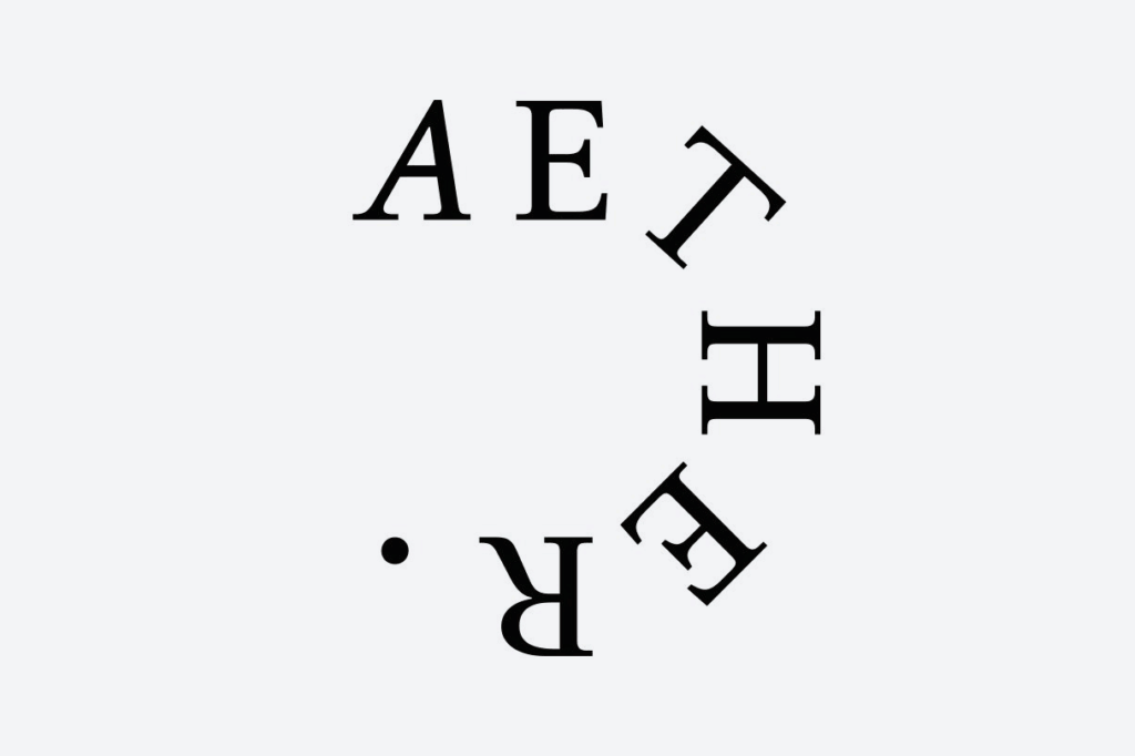
The logo’s lettering grew from my interest in the softness of Japanese calligraphy. Its fine serifs reminded me of the incense sticks themselves, while the looping shapes suggested smoke curling upwards. Finding a balance between those straight lines and rounded curves took some exploring. I liked the sense of the lettering coming back to itself. It connected with what interested me about the ritual in the first place: taking a moment to become more centred in yourself. I hoped that moment could begin before the incense was even lit.
Gryphon Audio Design
I grew up in a home where the speakers took centre stage and Miles Davis was often playing. When I first had some money of my own, I bought a good stereo. Hi-fi stayed a hobby, and I’d always hoped to find a way to work with it. I’d been looking around at Danish brands when I got talking with Rune at Gryphon. We hit it off over music and what good sound actually is. After a while, those conversations became a project: a packaging concept for the cartridge Gryphon was developing with Ortofon. The diamond at the needle’s tip gave us the shape of the case, and the name Black Diamond DLC grew out of our packaging discussions.
From there, we started talking about Gryphon’s fortieth anniversary and its identity. We approached it as a spring clean: simplifying the typography and redrawing the griffin, making everything sharper while keeping Gryphon’s character. Seeing that work on the equipment itself was something else. The first product to carry our updated logo was Hyperion. Seeing the logo we’d worked on light up bright red on the front of a beast like that was pretty cool.
MODU Storage Crates
There’s a detail of the crates stacked on top of each other that I really love. It seems a little random, but at the same time really controlled. It reminds me of the corner of a building where you can see that something has been made well. I wanted that architectural feeling for MODU’s Storage Crates: the sense of space you get in an almost empty room, where you start noticing the structure or a corner. The setup stayed deliberately close to a standard product shoot. Clear light. Simple forms. Only the product colours. Almost too simple, in a way, which felt right for such a straightforward product.
Photography by Peter Dalsgaard
The crates were stacked in a single colour and in combinations of colours. Peter Dalsgaard brought a depth to the images that makes them feel super sharp and detailed. A crate with modular blocks inside starts to look almost like a sculpture. That’s something I’m especially pleased with: how these ordinary objects can remind me of an architectural detail, just through the way they’re arranged and photographed. The simplicity was intentional, and so was the feeling of calm around it. This is actually a box for your space to be empty. I wanted you to feel some of that space just by looking at it.
Casio F-91W
As a kid, I remember going to Apple presentations and seeing the iBooks with their orange or blue edges. I had so many ideas about what I could do with a computer, but not the money to buy one. For me, the Casio F-91W was the poor child’s technology: something you could hold in your hand and feel part of the future. It looked insanely cool. The digital display, the light, the alarm, all in something so sleek and thin. It felt like it did everything. This project is an homage to that childhood feeling: if you just had that one thing—the right tool—everything would be possible.
With these renders, I wanted to get back to that feeling. The colours are exaggerated, almost holographic: blues, purple and yellow that meant technological coolness to me as a child. It’s about seeing the future in the glossiness of it, letting the colour and light follow my memory rather than the exact mechanics. I hope people who grew up with the watch recognise something of their own childhood here. Now we have more than enough technology, and it’s often the ideas, or the time to do them, that are harder to find.
MODU Balance Beams
Photography by Katrine Møbius
I remember wanting to explore everything as a child: smell it, feel it, jump over it, jump in it. But I also remember sitting, getting a bit bored, looking out of the window and trying to figure out the world. Both sides mattered in our art direction for the MODU Balance Beams. Balancing has something inherently childish about it, like crossing a stream on a piece of wood and hoping not to fall in. We wanted to capture that energy alongside the quieter moments of sitting and looking, when everything still feels new.
The warmth of photographs from the ’70s led us to analogue film and coloured paper backgrounds that are very obviously coloured paper. There’s something a bit naive about them, like old school portraits or a visit to a slightly crappy photographer. That feeling was part of what we liked: the warmth, the vibrant colours, the sense of being safe in your own little bubble. We hoped the photographs would speak to adults, too. Children play and reflect; as adults, we often keep the reflecting and forget the playing. These images are also a reminder to ourselves to look up, smell the flowers, and let something other than the next task catch our attention.
Kjellerup Væveri
I really loved the old Kjellerup Væveri logo. There’s something about logos from the 1950s that I’m drawn to: the lettering, the little quirks, the feeling that there’s a bit more going on. I think there’s room for that kind of complexity again, after so much simplification. The old mark mattered to their customers, too. After an earlier redesign replaced it with a sans serif, customers in Japan missed what they recognised as a sign of Danish tradition and quality. But the mill had also become more advanced. I drew the new wordmark as a single thread, keeping details like the old-fashioned Rs while giving the drawing a little more mechanical precision.
I also took inspiration from the emblems on old weaving and pressing machines. I wanted some of that feeling of being inside an industrial hall to come through in the marks, reflecting the machinery behind the textiles. What mattered to me was giving the mill a way to show that it stands by each product and is proud to say it was made in Denmark.
Tap to open. Hold then drag, or use two fingers on the board, to move an image. With a keyboard, press Enter to open or use arrow keys to move. Hold Shift for larger steps.